Customized dashboards, new order filters, and improved power visibility
We’ve upgraded the Cyxtera portal with features that make it easier to use, including the ability to download power usage and filtered order information.
Our latest updates to the Cyxtera portal bring a number of usability improvements we think you’ll like. You can customize your dashboard layouts, to push what matters most to you to the top. New filtering options make it easier to find and download orders. You can also export power data, and see peak, average, and aggregate power usage over the last week or month at a glance.
These enhancements are launching alongside the new Digital Exchange interface. Digital Exchange ushers in a new brand and a radical usability improvement from the Command Center portal. Find out more here.
Customize dashboard layouts
You can now personalize your screen layouts, to move whatever you’re most interested in to the top of the screen. Your changes only affect your own account, and are stored for when you log in again next time. You can, for example, customize the Overview screen, the Digital Exchange view for each location, and the maintenance information for one of your spaces. If you frequently scroll to find the information you need, you can now tailor your dashboards to push that information to the top.
- On the page you want to customize, click the three dots on the right beside one of the widgets. A widget is a section of your dashboard containing information. Your dashboards are made up of widgets stacked on top of each other. When you click the three dots a menu opens.
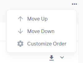
- Click Move Up to move the widget up one place, swapping it with the widget above. Use Move Down to move the widget down one place, swapping it with the widget below.
- Click Customize Order to open a menu to freely configure your dashboard layout. Click and drag the widgets in the dashboard to change the order. You could, for example, drag the Billing dashboard from near the bottom to the top. You can make as many changes as you like.
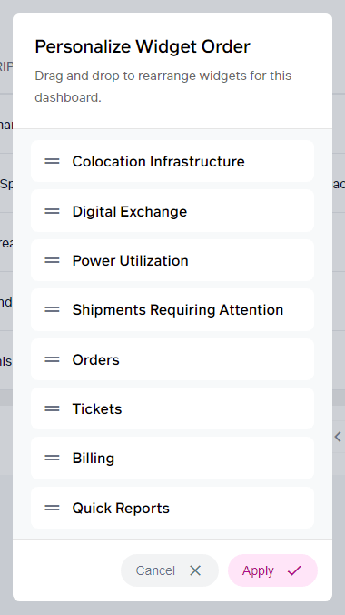
- To confirm your changes, click Apply. To discard them, click Cancel.
Filter orders by status, contact, and date
Customers have asked us to make it easier to find orders. We have now added filters so you can filter orders by status, contact, and date before reading them on screen or exporting them. People often want to be able to see only their orders, or those of a colleague who is out of the office.
- Log in to the Cyxtera portal.
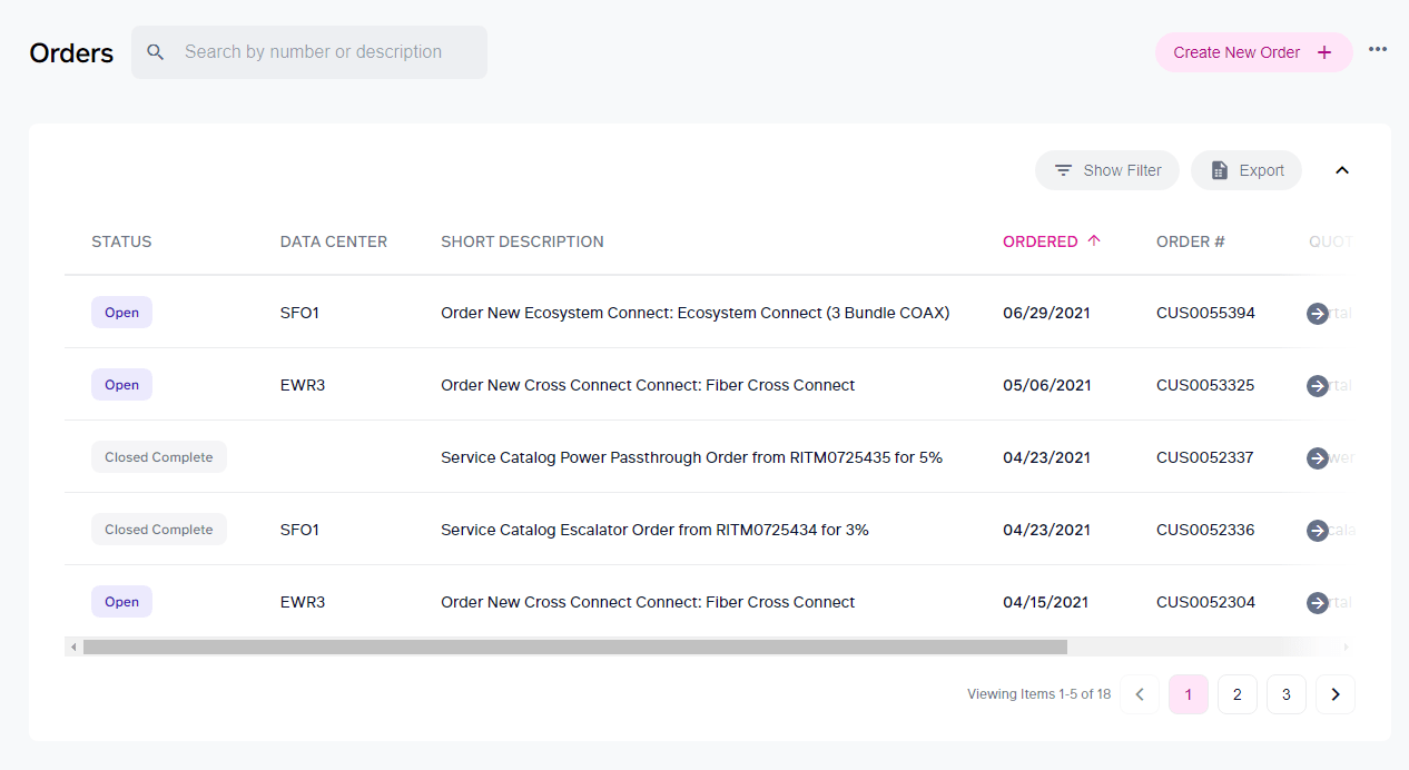
- On the Overview screen, find the Orders widget.
- Click the Show Filter button above your list of orders.
- If you want to filter by status, check the boxes for the statuses you want to see.
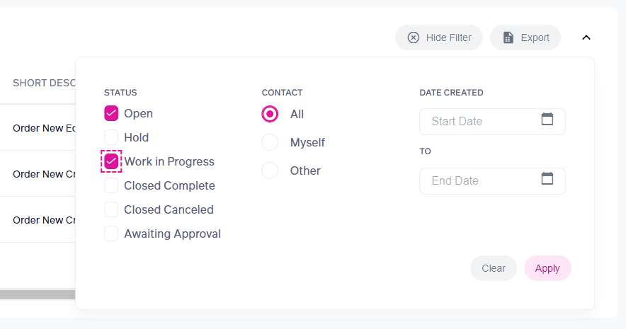
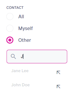
- To see your own orders only, select Myself in the Contact section. To select another contact, select Other. Type a name to filter the list of names. Select one of the shown contacts to use it for your filter.
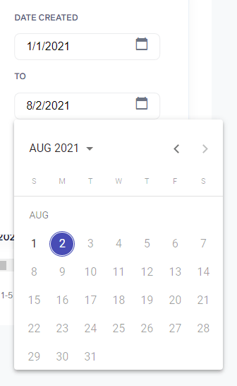
- To filter by date, use the Start Date and End Date boxes. Click the calendar icon inside a box to use a date picker. You can page through the months using the < and > arrows, or click the month name to choose a year, a month, and then a date.
- Click Apply to apply your filter.
- You can click Export to download a .csv file you can view in Excel. When a filter is applied, your .csv file contains only the orders shown with your filters applied.
- To clear your filter, click Show Filter, Clear, and Apply.
Export power data
You can now export power data as a .csv file, so you can analyze it in Excel or your choice of analytics tool. There are three places you can export power data:
- From the Power Utilization widget in the Overview screen, which gives you your total power consumption across your data centers
- From the data center view (for example, click Spaces on the navbar, then select a data center)
- From the rack view (for example, click Spaces on the navbar, then choose a rack)
In each case, click Export on the right to save your .csv file. These three options enable you to analyze your average and peak power usage, in varying degrees of granularity (rack, data center, account).
Quickly view a power summary
We’ve enhanced the Power Utilization and Aggregate Usage graphs for cages, so you can quickly see your peak and average usage for the last week or last month.
- In the portal, view the cage you are interested in (for example, click Spaces on the navbar, then select a cage).
- In the Environment section, find the widget for Power Utilization.
- Select the time period, either the last month, or the last 7 days.
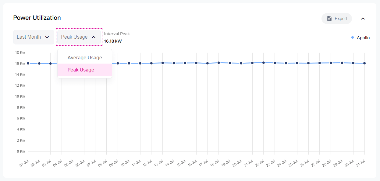
- Select either the peak usage, or average usage.
- The peak or average for that time interval is displayed next to the options, above the graph.
- The Aggregate Usage graph below has similar options for viewing the aggregate usage for the last month or the last 7 days.